


Paper Whiteness, Brightness & Shade
Professional printers and designers understand the concepts of paper whiteness and brightness, however for many these terms are industry insider knowledge that isn't well known at all.
As with both paper size and paper weight there is a difference in standard usage between North America and the rest of the world. Internationally Whiteness is the most commonly used measure as defined by the CIE (Commission Internationale de l'Eclairage - International Commission on Illumination) whereas in the US the most commonly seen measure is Brightness as defined by the TAPPI (Technical Association of the Pulp and Paper Industry). Shade is universal and represents the colour of the paper measured on the CIE LAB model (more formally known as CIE L*, a*, b*).
Paper Whiteness
The CIE measure of whiteness is a measurement of the light reflected by the paper across the visible (daylight) spectrum. The CIE have set a standard of D65 illumination which is a standard representation of outdoor daylight under which the amount of light reflected is measured. For a perfect reflecting non-fluorescent white material the CIE whiteness would be 100, however most 'white' paper will have CIE whiteness measures of between 130 and 170 due to the addition of Optical Brightening Agents (OBAs) which are designed to reflect light from the non-visible range (mainly ultra-violet) back in the visible spectrum.
The lighting conditions under which the paper is viewed may well affect how a person sees the paper, paper that has a high whiteness achieved by adding large amounts of OBA to a fairly dull original sheet it may appear to be bright outside but less bright under indoor lighting conditions. On the other hand a sheet with a good white base but low amounts of OBA will compare well under indoor lighting but may appear duller outdoors. This phenomenon is known as Metamerism and should be considered if you are putting together a document from a number of sources as it may affect the way the document is perceived under different lighting conditions. It is always best to ensure that the paper sourced for all parts of the document is of the same type as far as is possible.
Paper Brightness
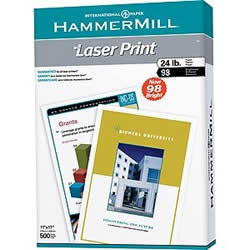
Ream of 98 brightness paper - showing clearly 98 on the packaging.
Brightness, as specified by the TAPPI is the measurement of the amount of reflectance of blue light (Wavelength 457 nanometers, 44nm wide). There is also an ISO standard for measuring brightness (ISO 2469 - Paper, board and pulps -- Measurement of diffuse radiance factor) but this is rarely used as the CIE whiteness scale is the more common measurement.
As with whiteness it is common to see brightness measurements of over 100, which means that more light is reflected than was originally shone on the paper, this is due to Optical Brightening Agents reflecting part of the ultra-violet spectrum back in the visible spectrum. Measurement for TAPPI brightness are often in the 110 - 120 range, lower than commonly found CIE whiteness measures as the OBA's only have a small spectrum to reflect.
Paper Shade
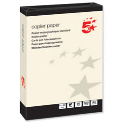
Ream of Cream Tinge Paper.
When you see a piece of white paper you may see it as having a bluish tinge or a creamy tinge to it, this is because it is very difficult to create a "true white". A true white paper will reflect all the colours of the spectrum equally, whereas a blue white shade absorbs some of the longer wavelength red and green light and reflects more of the shorter wavelength blue light and a cream white shade absorbs more blue light.
The shade of paper is almost invariably measured on the CIE LAB model (CIE L*, a*, b*) as this model covers the full colour space, whereas other models such as RGB or CMYK cover a subset of the LAB space.
When selecting paper for printing a blue white shade is best for short documents as this provides the best contrast for black ink and gives optimum readability. However for book publishing a more neutral or cream white shade is often used as this gives less glare and produces less strain on the eyes over a longer period of reading. True white shades are often also used for printing when the document contains warmer colours in the red, orange and yellow ranges.